
How to Incorporate Pantone’s Trending Fall Colors into Your Home
Labor Day is just around the corner, which means two things: summer is winding down, and we’re about to have one of our largest sales of the year. If you’re due for a home refresh, but don’t know where to start, don’t sweat it: we worked with our design experts to select canvas artworks that are perfect for this transitional time of the year, and that will remain timeless.
We’ve gathered six works of art that will keep your home looking welcoming and fresh. Taking inspiration from Pantone’s trending fall colors, we pulled prints that incorporate them in versatile, unique ways. Got a favorite? Let us know in the comments below!
Pantone Martini Olive
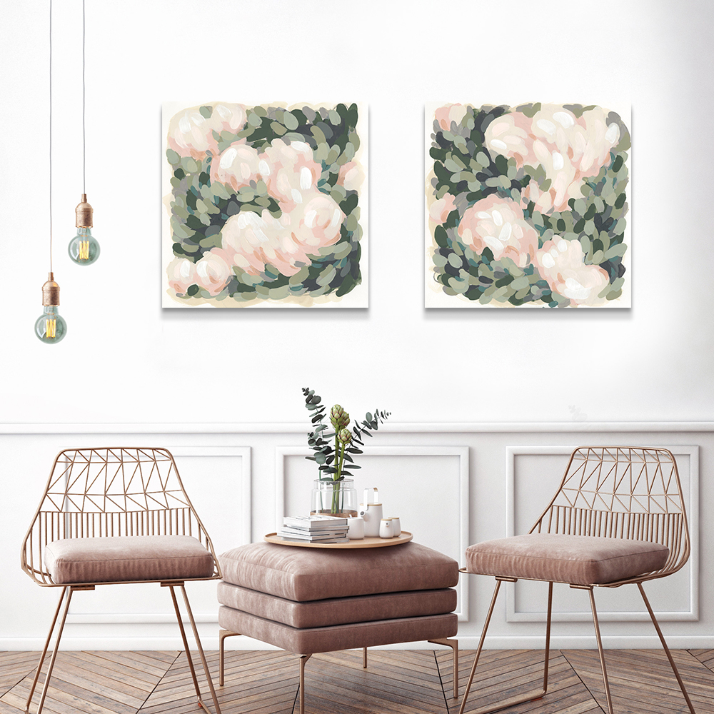
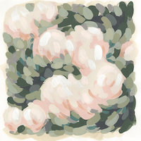
Blush & Celadon I, June Erica Vess 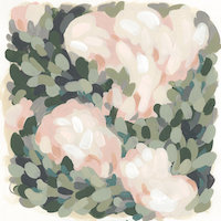
Blush & Celadon II, June Erica Vess
Pantone’s Martini Olive is trending this fall season. Soft pinks and corals complement this shade of olive. June Erica Vess‘ works Blush & Celadon I and II are perfect examples of this classic pink and green color combination. You’d typically find this combination with a brighter pink, but here it is muted for the fall. The pink is feminine while the green is dark, subtle and more neutral. Try hanging these prints in a room with gold or copper metallic accents.
Pantone’s Quetzal Green, Russet Orange and Sargasso Sea
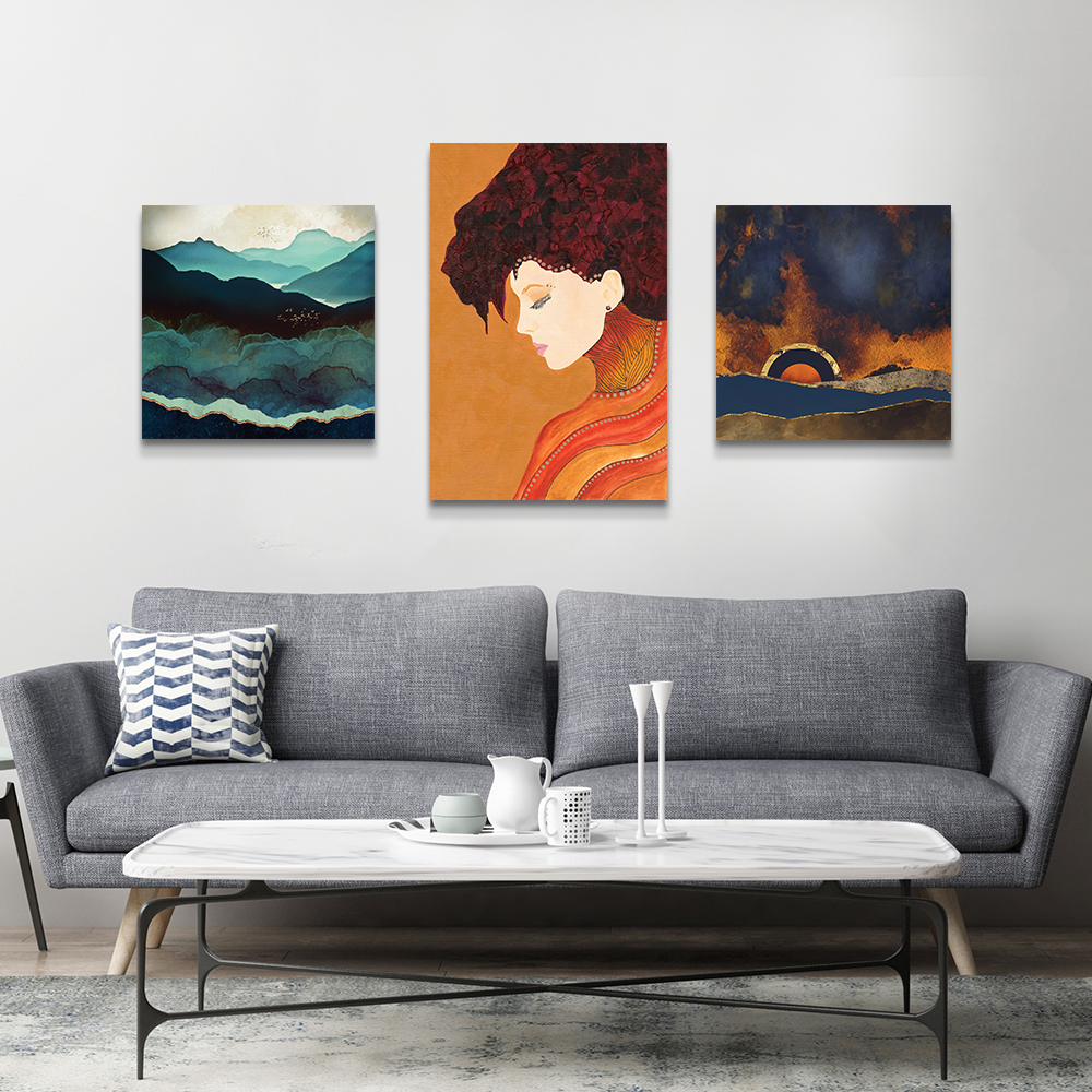
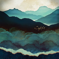
Indigo Mountains, SpaceFrog Designs 
Anne, Viviana Gonzalez 
Before The Storm, SpaceFrog Designs
Here, we’ve combined quite a few Pantone shades that contrast and complement each other for any neutral room. SpaceFrog Designs’ Indigo Mountains combines Pantone’s Sargasso Sea and Quetzal Green in a way that adds visual depth, and leaves audiences feeling calm. These blues create a wonderful balance with the third print–also by SpaceFrog–Before the Storm. This print blends Sargasso Sea with warm, contrasting shades of Russet Orange. Finally, Vivianna Gonzalez’s Anne warms the collection in the middle with more orange, making these three prints cohesive.
Pantone Valiant Poppy & Red Pear
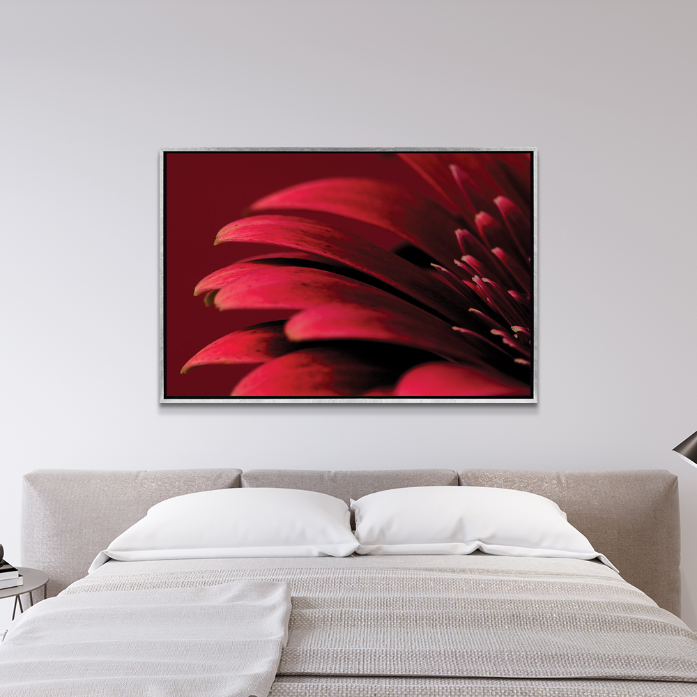
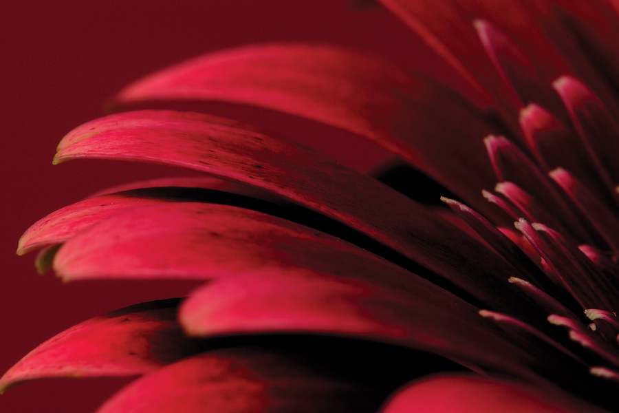
Tom Quartermaine’s Petals of a Red Gerbera is a vibrant artwork that uses Pantone’s Valiant Poppy Red and Red Pear, giving it lifelike dimension. We love this piece for a bedroom, living room or study; these shades of red may seem bold, but when combined make a striking yet soothing focal point.
Take advantage of our crazy good sale, and let us know if you decided to take inspiration from these trending Pantone colors!