
Does Wall Art Need to Match Your Furniture? Here’s the Real Answer | iCanvas
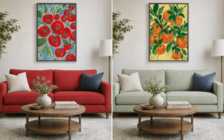
No, wall art doesn’t need to match your furniture. It needs to coordinate with it, through shared undertones, proportional scale, or complementary texture, not identical colors. Here’s what that actually means for your space.
Quick takeaways:
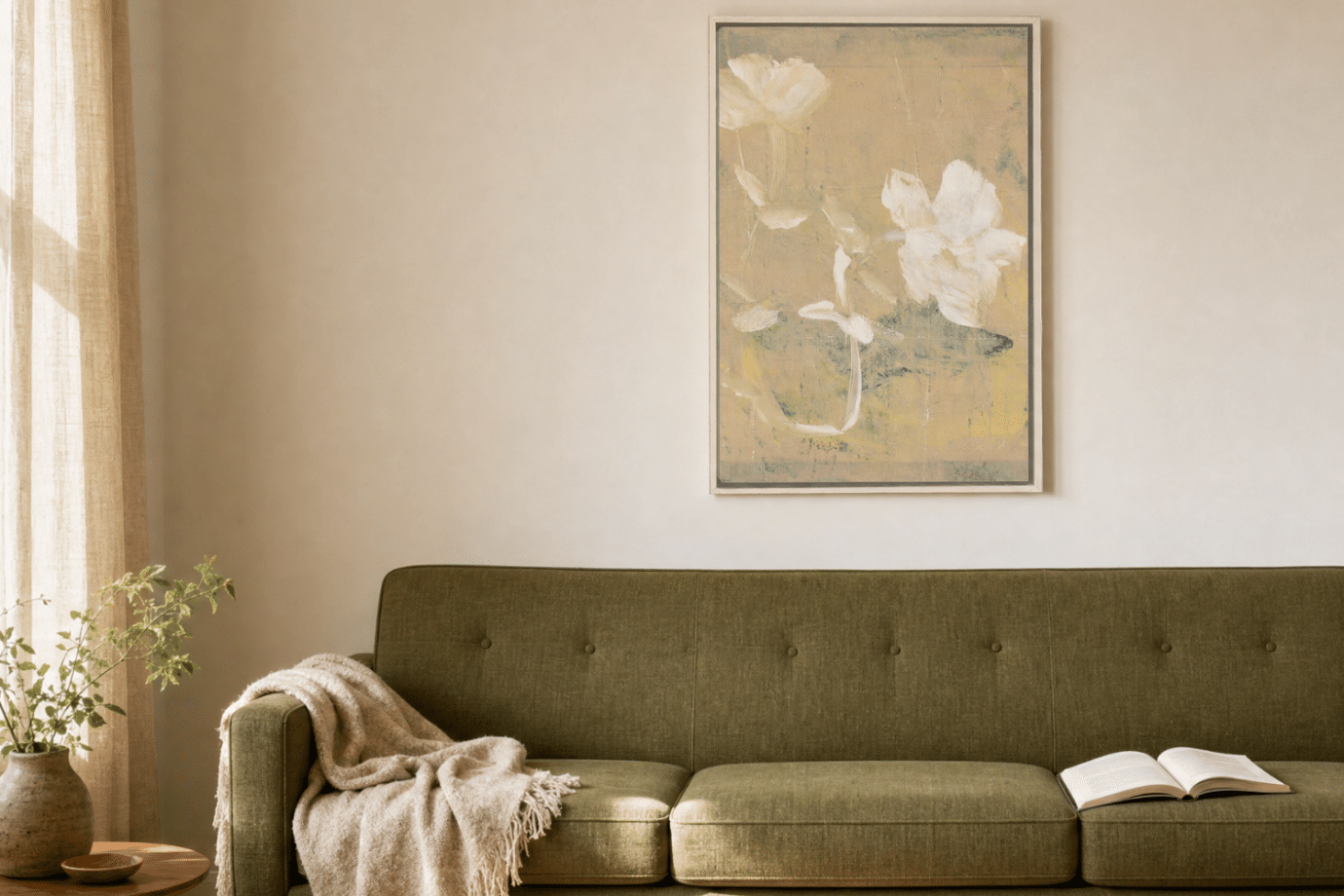
- Matching means identical colors. Coordinating means a shared thread, like undertone, texture, or scale.
- Neutral rooms often need art to introduce color, not echo it.
- Scale matters as much as color. A well-sized piece can “work” even if the palette isn’t a perfect match.
- Style consistency beats era-matching. Modern furniture doesn’t require modern art, and vice versa.
Why Do People Think Wall Art Has to Match Furniture?
Blank walls stay blank for a reason. Somewhere along the way, “matching” became shorthand for “safe,” and safe felt like the only way to avoid a room that looks off. So then, the hunt for an exact art color match becomes a big challenge that never gets completed. The question loops: does this go with what I already have?
Here’s the thing about that instinct: rooms that match too precisely tend to read as generic, like a hotel lobby or a showroom, not somewhere a person actually lives. The goal was never an exact match. It was always something closer to harmony, and harmony has more room to breathe than most people think.
Does Wall Art Need to Match Furniture, or Just Coordinate With It?
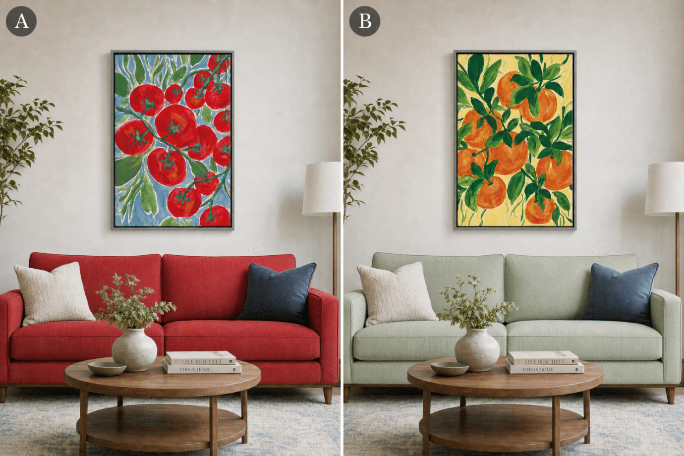
Matching means your art and your sofa are working from the same main color, more or less exactly. Coordinating means they’re working from the same language: a shared undertone, a repeated accent color elsewhere in the room, a complementary contrast. One is rigid. The other has range.
Picture a cool-gray sofa. A piece in warm terracotta doesn’t match it, not even close on paper. But if that terracotta echoes the wood tones in your coffee table or the brass on a lamp base, it’s coordinating with the whole room, not just the upholstery. That’s the shift: stop asking “does this match the couch?” and start asking “does this belong in the room?”
This is where a lot of abstract art earns its keep. Abstract pieces tend to carry multiple tones at once, which gives them more coordinating power than a single-color print. One piece can pick up your rug’s warmth and your walls’ coolness in the same frame.
Learn about the benefits of abstract art for adding creativity to your space!
What Should Actually Coordinate Between Wall Art and Furniture?
Four things actually matter here, and none of them are “the exact same color.” Undertone, scale, texture, and style each do their own quiet work in a room. Get even one of them right and the piece will feel like it belongs, no perfect match required.
Do Wall Art and Furniture Colors Need to Share an Undertone?
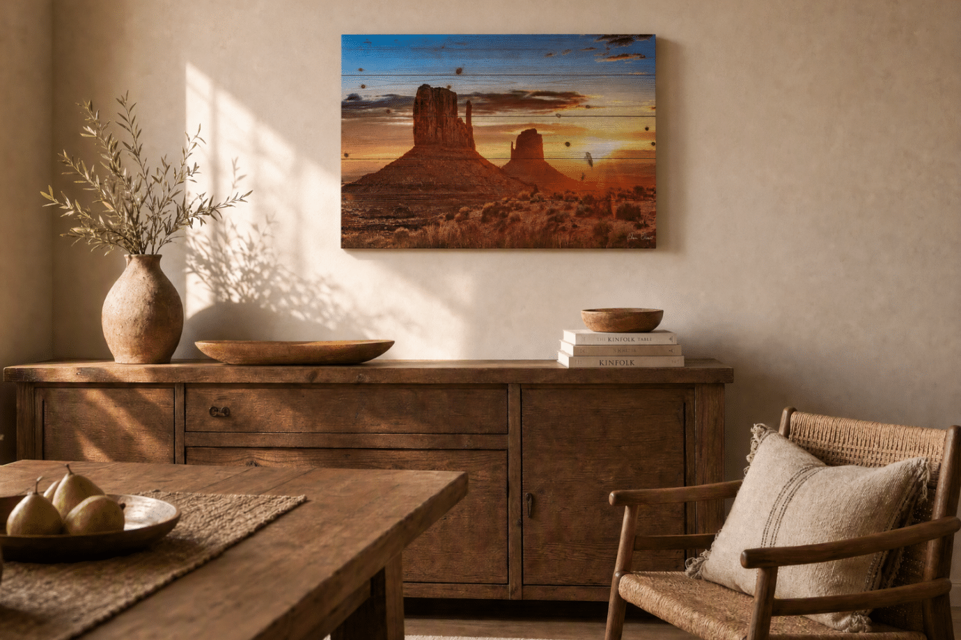
Every room has an undertone in warm or cool. Yellow-toned wood floors, red-brown leather, golden brass hardware: that’s a warm room. Gray-toned floors, white walls, chrome and silver fixtures: that’s a cool one. Art doesn’t need to match the dominant color, but it should acknowledge the undertone rather than fight it.
A cool-toned print in an overwhelmingly warm room can still work, as long as there’s a bridge to merge the tones. This can be something like a wood frame that keeps it from feeling out of place.
Explore our framed canvas prints to discover the best frame color for your space
What Size Wall Art Works Best Above Furniture?
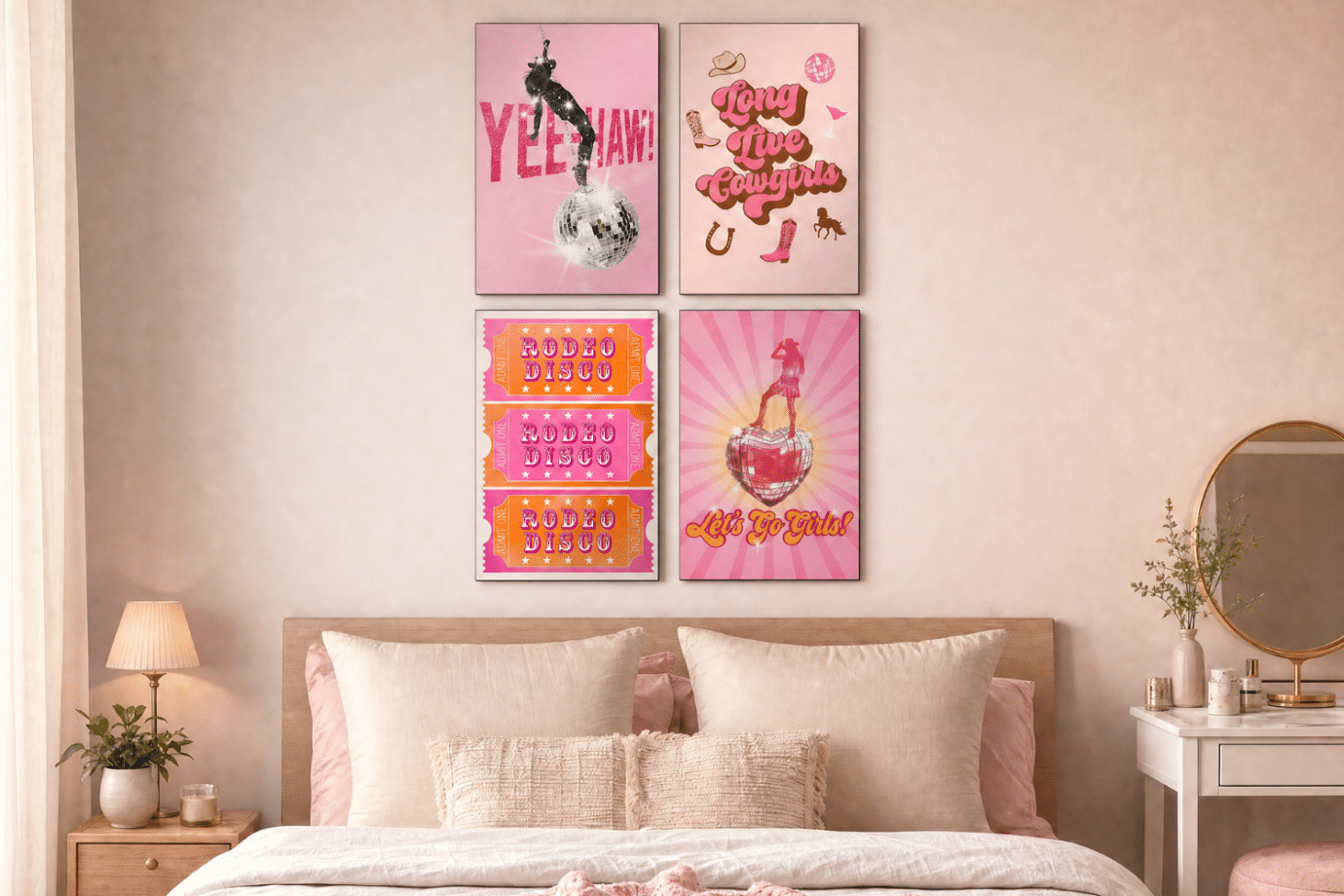
Undersized art is the single most common styling mistake, more common than any color mismatch. A small piece above a large sofa can feel like something is missing. As a rough guide, art (or a grouped arrangement) should span roughly two-thirds the width of the furniture beneath it.
Oversized furniture calls for one large, confident piece. Smaller furniture or tighter walls do better with a grouped arrangement of smaller pieces that read as one cohesive block.
That’s part of what makes a Steelpix gallery wall useful here. Instead of hunting for one perfectly-sized piece, a cluster of metal artworks can hit that same two-thirds proportion rule through grouping rather than size. The scale lesson holds either way: it’s not about how big any single piece is, it’s about how much of the wall the whole arrangement claims.
Read our guide on how to choose the right size art for your space
Can Wall Art Texture Contrast With Furniture Texture?
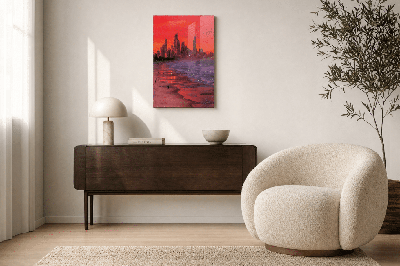
Texture is the most overlooked coordinating tool. A glossy acrylic print against a bouclé or velvet chair isn’t a mismatch, it’s a deliberate contrast, the kind interior designers lean on constantly.
Find satisfying contrasts like smooth against soft or reflective against matte. A textured, matte art piece tends to disappear into a room that’s already full of natural materials like linen, wool, and unfinished wood.
Does Modern Furniture Require Modern Art?
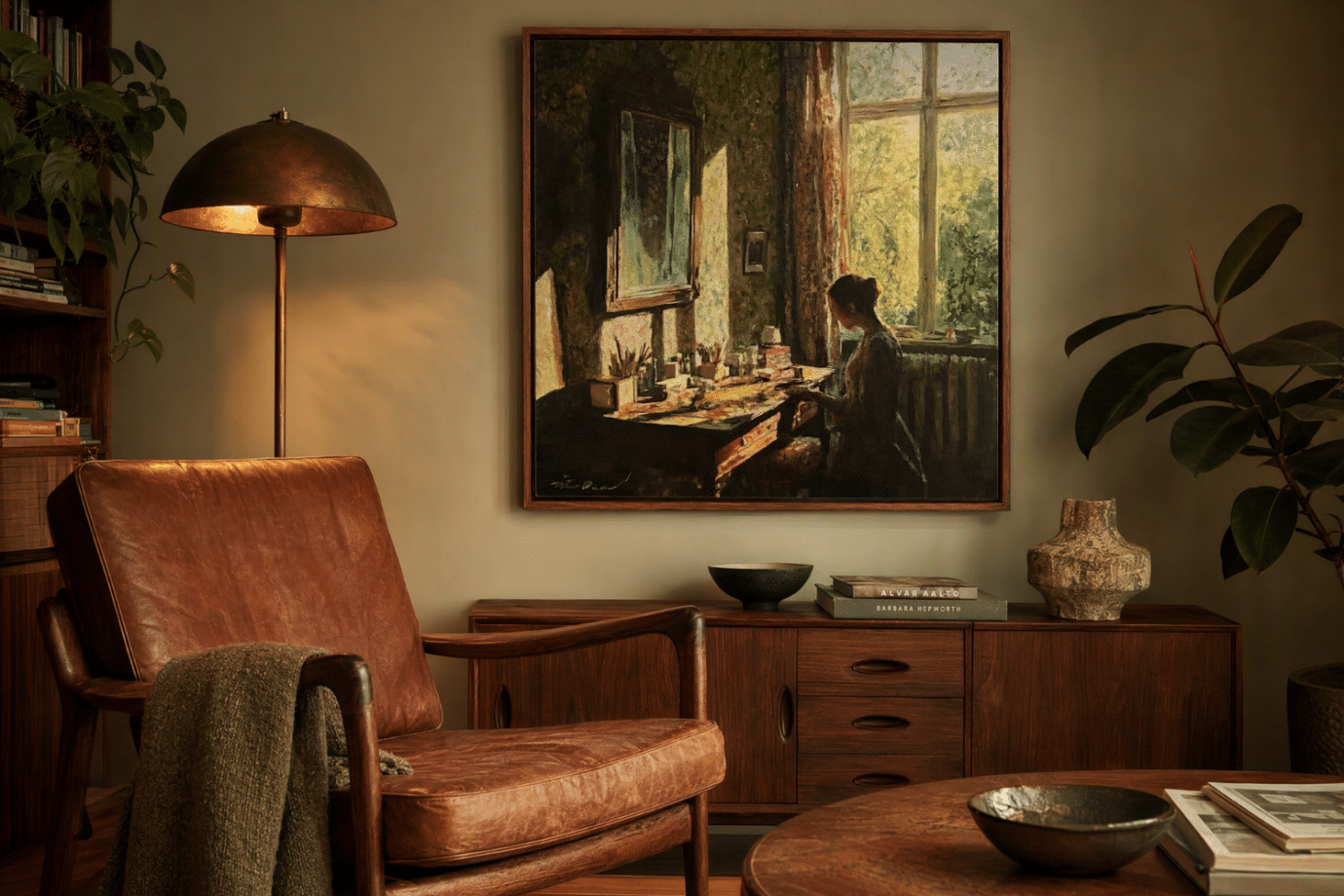
This one trips people up more than color ever does. Modern furniture doesn’t require modern art, and traditional furniture doesn’t require traditional art, but that’s not permission to ignore mood entirely either. Sometimes the strongest move is contrast, such as a clean-lined, minimal sofa holding its own under a loose, abstract expressionism art piece.
Other times, the room already has a clear identity, like dark wood, leather, brass, and warm ambient light, and the better move is to lean all the way into it. A classic, painterly piece in the same warm palette as the furniture around it can feel just as intentional as any contrast, especially in a room where every material is already telling the same story.
Style pairing isn’t about matching or breaking the era. It’s about deciding whether your room wants tension or harmony, then committing to it.
When Does Contrasting Wall Art Work Better Than Matching?
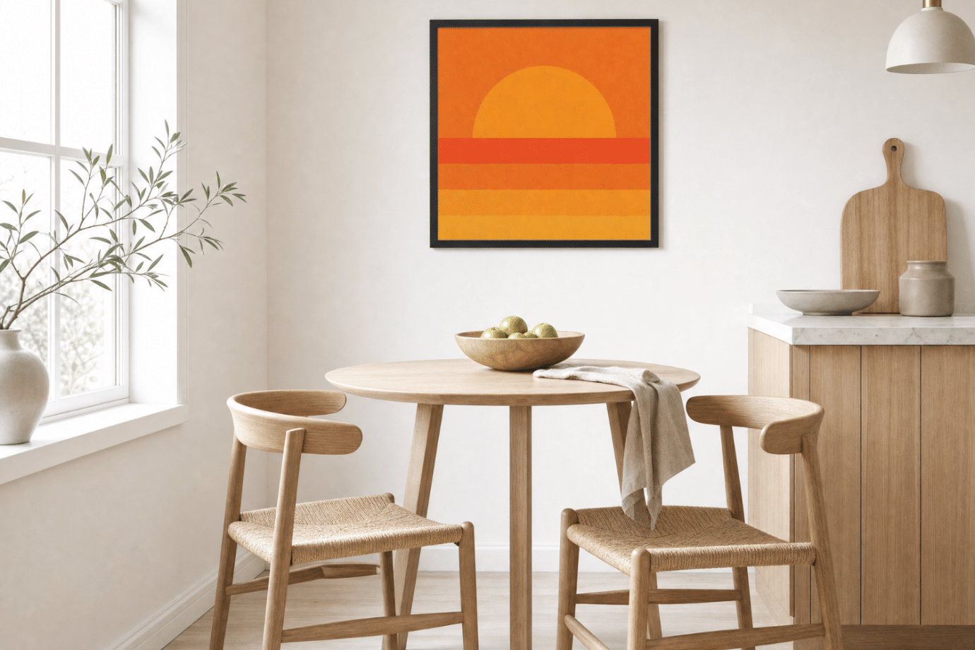
Every rule here bends when the room itself is neutral. A space built entirely from beige, gray, and white doesn’t need art that plays it safe too, it needs art that does something.
In an all-neutral room, one saturated, high-contrast piece isn’t a risk. It’s often the only personality the room has. This is where the instinct to match works directly against you: the safest-feeling choice actually leaves the room flatter than it started.
Check out colorful art to make any neutral room pop with personality
How Do You Know If Your Wall Art and Furniture Work Together?
Skip the overthinking with a simple gut check:
- Step back ten feet. Does your eye move easily between the art and the furniture, or does something snag?
- Find one shared thread. You only need one, an undertone, a repeated color in a small accessory, a texture, not five.
- Live with it leaned against the wall first. Give it a few days before committing to hooks and hardware.
- If it still feels off after a week, check scale before you check color. More often than not, sizing is the real issue, not the palette.
How to Choose Wall Art That Works With the Furniture You Already Own
There’s no single rulebook for this, and that’s the actual good news. A cool-toned abstract can sit beautifully above a warm leather sofa if the scale is right and one small accent ties them together. A gallery wall of smaller pieces can carry the same visual weight as one oversized canvas. None of it requires a perfect color match, just an intentional one.
If you’re staring at a blank wall right now, start with what you already love, not what technically matches. Coordinate from there.
Browse art by room to see pieces styled in spaces like yours, or explore by color if undertone is the piece of the puzzle you’re missing.