How to Choose Art That Matches Everything | iCanvas
If you’ve ever stood in your living room thinking, I just want art that matches everything, you’re not alone. Choosing wall art can feel permanent, like one wrong color will throw off your whole space.
But here’s the truth: you don’t need art that matches everything. You need art that anchors everything.
When you try to perfectly match your sofa, rug, throw pillows, and future design plans, you often end up choosing something so safe it disappears. The result? A room that feels coordinated… but forgettable.
The secret is choosing art that works across styles, colors, and seasons; art that grounds your space while allowing the rest of your decor to evolve.
TLDR; Art that matches everything typically features neutral tones, balanced composition, and timeless subject matter. Instead of blending in completely, the best versatile wall art anchors a space while allowing furniture and decor to evolve around it.
Table of Contents
What Does “Art That Matches Everything” Actually Mean?
When people search for art that matches everything, they usually mean art that won’t clash, both now or later. That versatility comes down to four key traits:
1. Neutral, But Not Flat
Neutral wall art doesn’t mean beige on beige with no personality. The most adaptable pieces use layered neutrals with depth, such as:
- Warm tan shades
- Soft blacks and grays
- Cream + taupe combinations
- Muted greens
- Butter yellow tones
These colors complement most flooring, upholstery, and wood finishes while still feeling intentional.
2. Balanced Composition
Versatile wall art sits in the sweet spot between too busy and too bare.
- Not overly detailed
- Not ultra-minimal to the point of disappearing
- Enough visual weight to hold a wall
Balanced composition helps art feel steady even if the rest of your decor changes.
3. Timeless Subject Matter
Some subjects naturally work across design styles:
These themes transcend trends and feel at home in modern, transitional, rustic, and contemporary spaces alike.
4. Adaptable Scale
Scale matters more than people realize.
- Medium-to-large statement pieces feel intentional.
- Neutral gallery walls can grow with your space.
Art that’s too small often feels like an afterthought, and that’s when it clashes.
The 5 Safest (But Still Stylish) Categories of Art
If you’re looking for art for any decor style, these categories are consistently versatile.
Neutral Minimalist Art
Soft abstracts and tonal compositions work in minimalist, modern, transitional, and even rustic homes. Because they focus on shape and texture rather than bold color, they adapt easily to changing decor.
Featured Print: “S” by LEEMO
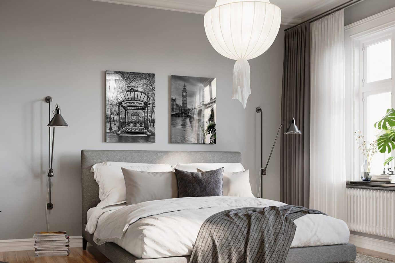
Black & White Photography
Black and white photography is one of the most timeless forms of versatile wall art. It pairs with warm or cool tones and works in nearly every room, from bedrooms to offices.
Featured Prints: “Metropolitain Paris Black And White” and “Big Ben and Palace of Westminster III” by Susanne Kremer
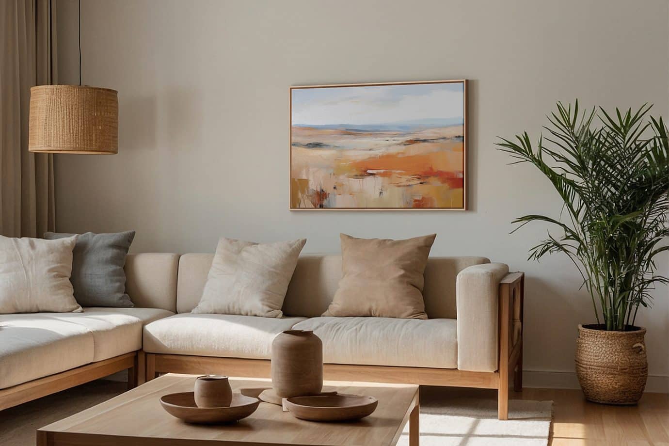
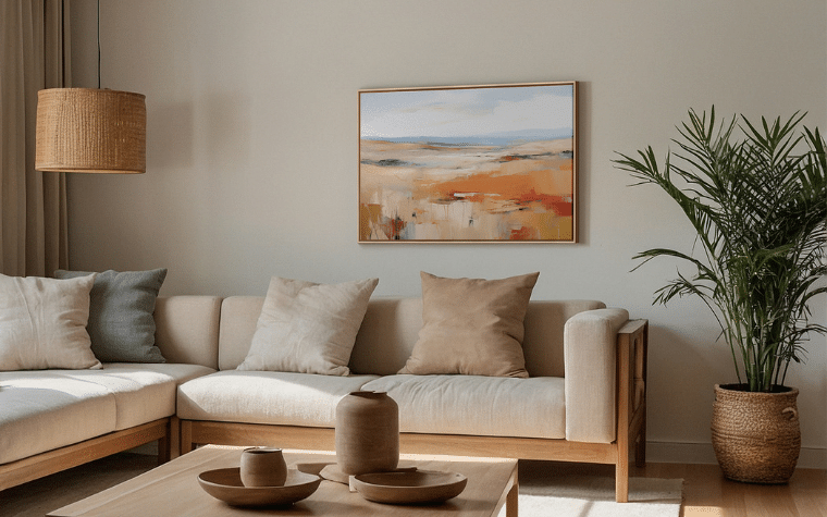
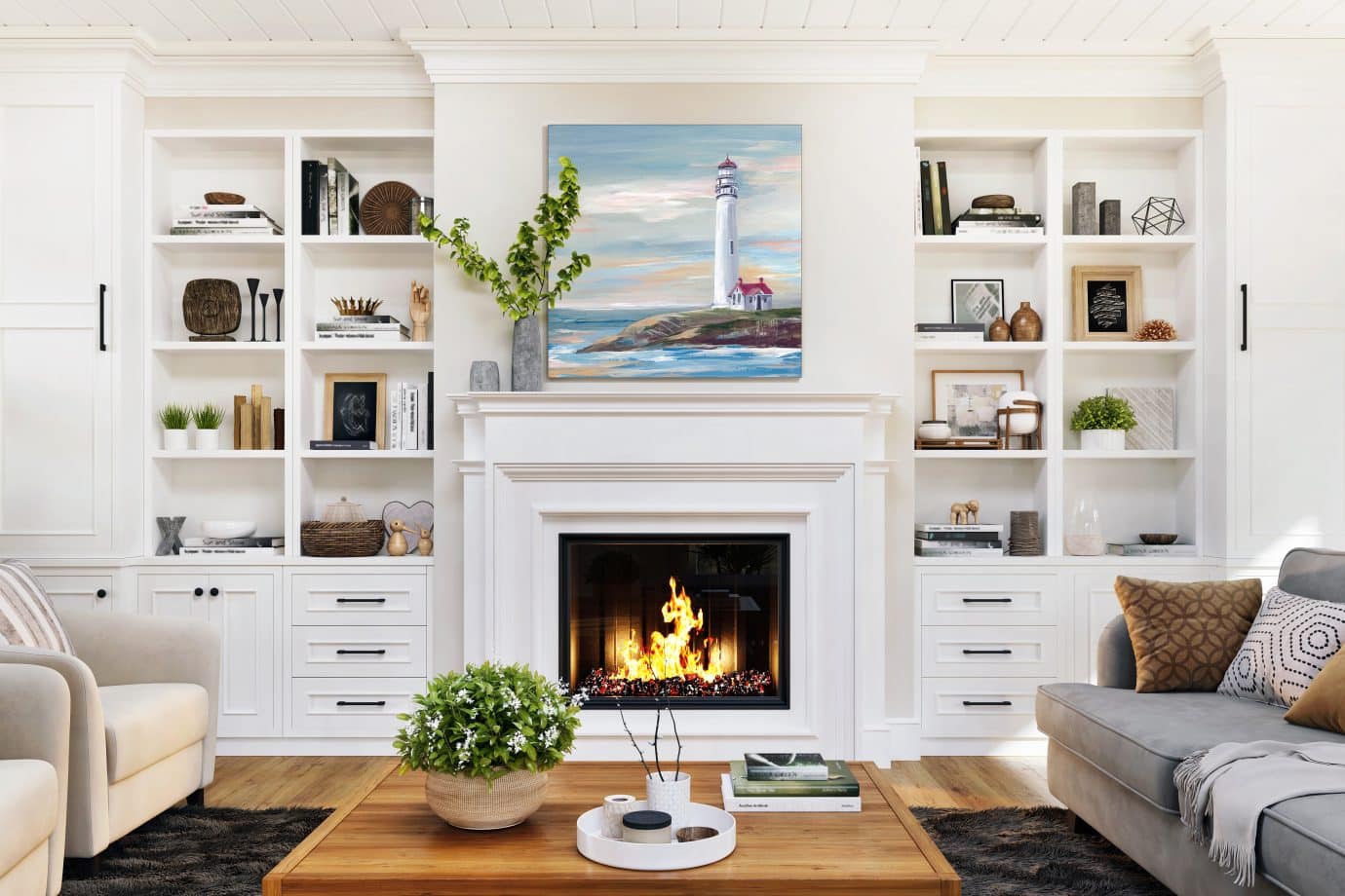
Earth-Tone Landscapes
Desert scenes, mountain vistas, and soft horizon lines in sandy, clay, and sage tones feel grounded and calming. They blend seamlessly into changing furniture styles and seasonal decor.
Featured Print: “Palette Landscape” by Heidi Kuntz
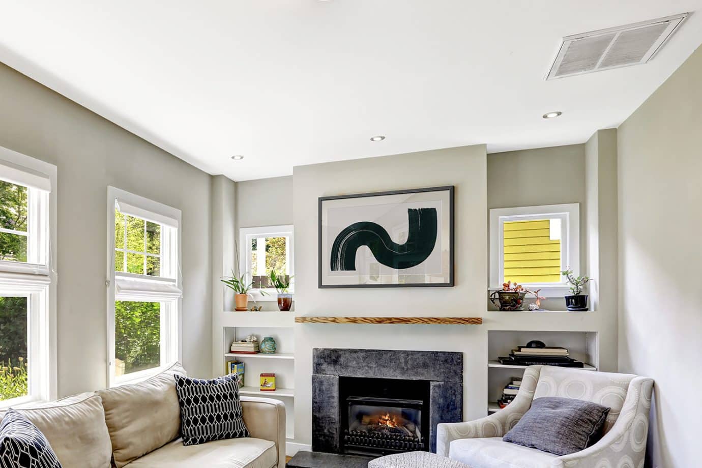
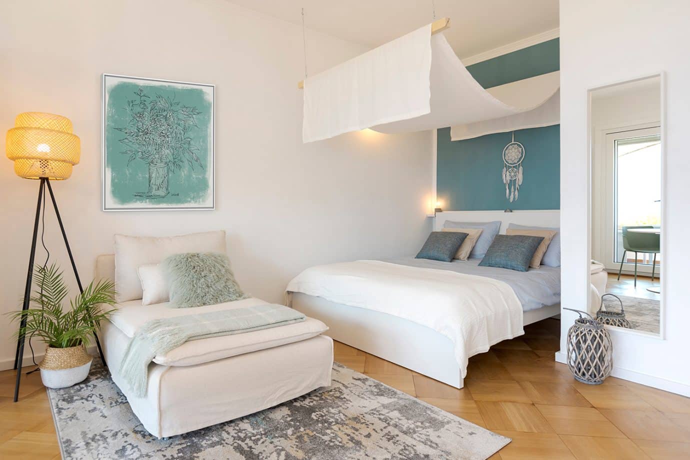
Minimal Line Art
Lightweight and airy, line art works beautifully in small spaces. Its simplicity makes it adaptable, especially in apartments or evolving homes.
Featured Print: “Zinnias In Glass Jar Sketch” by Anne Tavoletti
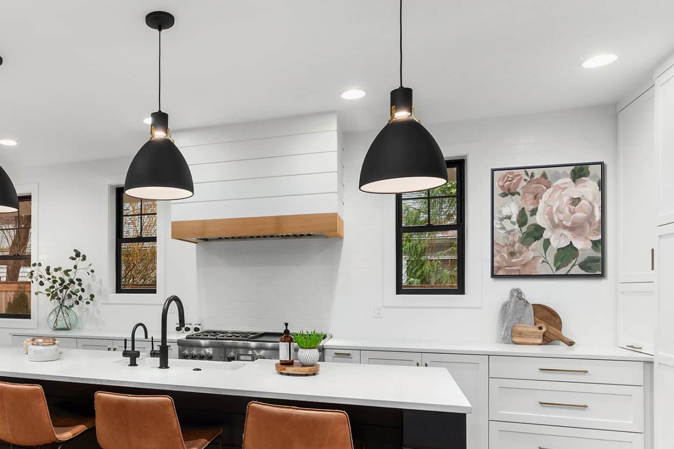
Soft Botanical Prints
Botanical art feels fresh in spring but calm and classic year-round. Subtle greens and neutrals help these pieces work in kitchens, entryways, and living rooms alike.
Featured Print: “Sunshine Blooms I” by Nan
How to Choose Art That Won’t Clash With Future Decor Changes
Follow these five guidelines:
- Choose undertones that match your flooring.
Warm wood floors pair best with warm neutrals. Gray-toned flooring works well with cooler palettes. - Stick to 2–3 dominant colors.
Too many competing hues reduce versatility. - Avoid trend-heavy color blocking.
Highly specific color combinations can date quickly. - Go one size bigger than you think.
Large art feels intentional and less likely to clash. - Choose emotional neutrality.
Calm, grounded, serene artwork adapts more easily than high-intensity imagery.
When you focus on undertones and scale rather than perfect matching, you create a space that feels cohesive, even as furniture rotates.
Quick Checklist: Art That Matches Everything
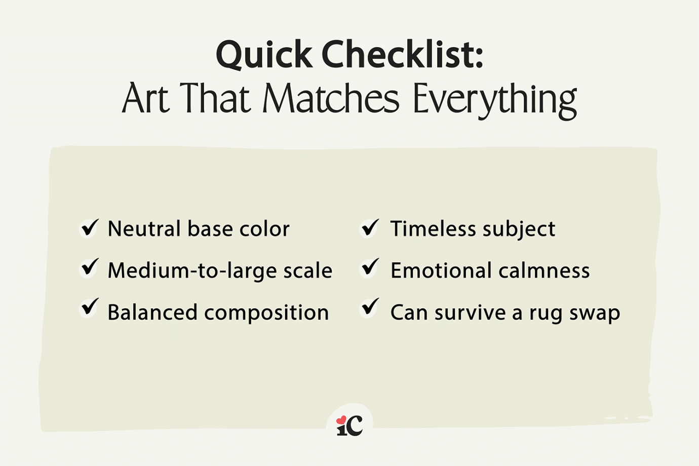
Use this checklist when shopping for versatile wall art:
✔ Neutral base color
✔ Medium-to-large scale
✔ Balanced composition
✔ Timeless subject
✔ Emotional calmness
✔ Can survive a rug swap
If your piece checks most of these boxes, it will likely work across multiple design shifts.
You Don’t Need Art That Matches Everything,You Need Art That Grounds Everything
Here’s the reframe: art is not supposed to blend into the background. It’s supposed to ground the room. The right piece of art becomes the anchor that holds everything together. Choose something versatile, but not invisible. Something neutral, but not flat. Something timeless, but still expressive.
Explore collections designed to work in any space:
FAQ: Art That Matches Everything
▼View the Questions
What type of art matches everything?
Art that matches everything typically features neutral tones, balanced composition, and timeless subject matter. Neutral abstract art, black and white photography, earth-tone landscapes, and minimal line art are especially versatile because they adapt easily to changing decor styles.
What color art goes with any room?
Beige, taupe, warm white, soft black, muted green, and earthy clay tones tend to work in most spaces. The key is choosing art with undertones that complement your flooring and larger furniture pieces.
Is neutral wall art boring?
Not when it’s properly scaled and thoughtfully designed. Large neutral wall art can make a strong visual impact without overwhelming a space. Texture, contrast, and composition keep it interesting while remaining versatile.
How do I choose art that won’t clash with future decor changes?
Focus on undertones, limit the color palette to two or three dominant hues, and choose timeless subject matter. Medium-to-large pieces with emotional neutrality (calm, grounded, serene) are more adaptable over time.